Graphs & Tables
Reading, interpreting, and extracting information from bar graphs, line graphs, pie charts, histograms, frequency tables, two-way tables, schedules, and other structured data displays
Generate Unlimited Practice Questions
Sign up for free and get 50 practice questions to start your prep.
Start Free PracticeLearn This Topic
Imagine trying to tell your friends about your epic video game stats by reading them a giant, boring list of numbers. Snooze, right? 😴 That is exactly where graphs and charts come in! They are like pictures that tell a clear story using numbers. Instead of staring at a confusing list, you can just look at a colorful picture and instantly see who scored the most points, what the most popular pizza topping is, or how much your pet lizard grew this year. 🦎📊
On the SSAT, you will see a few different types of these number-pictures. Bar graphs use tall rectangles to compare things (like which season sells the most ice cream). Line graphs connect dots to show how things change over time (like tracking your allowance over the months). Pie charts look like actual sliced pizzas 🍕 and show how a whole thing is divided into parts. Finally, histograms look a lot like bar graphs, but they group numbers into ranges (like how many basketball games ended with a score between 60 and 70 points).
The secret to crushing graph questions on the SSAT is to be a math detective! Always read the title of the graph first. Then, look closely at the labels on the bottom (the x-axis) and the side (the y-axis). What are they measuring? Are they counting by 1s, 2s, 10s, or even 100s? If you take a few seconds to understand the map of the graph, finding the right answer will be a piece of cake! 🍰
Practice Questions
4 practice questions for SSAT Middle Level
Show Solution
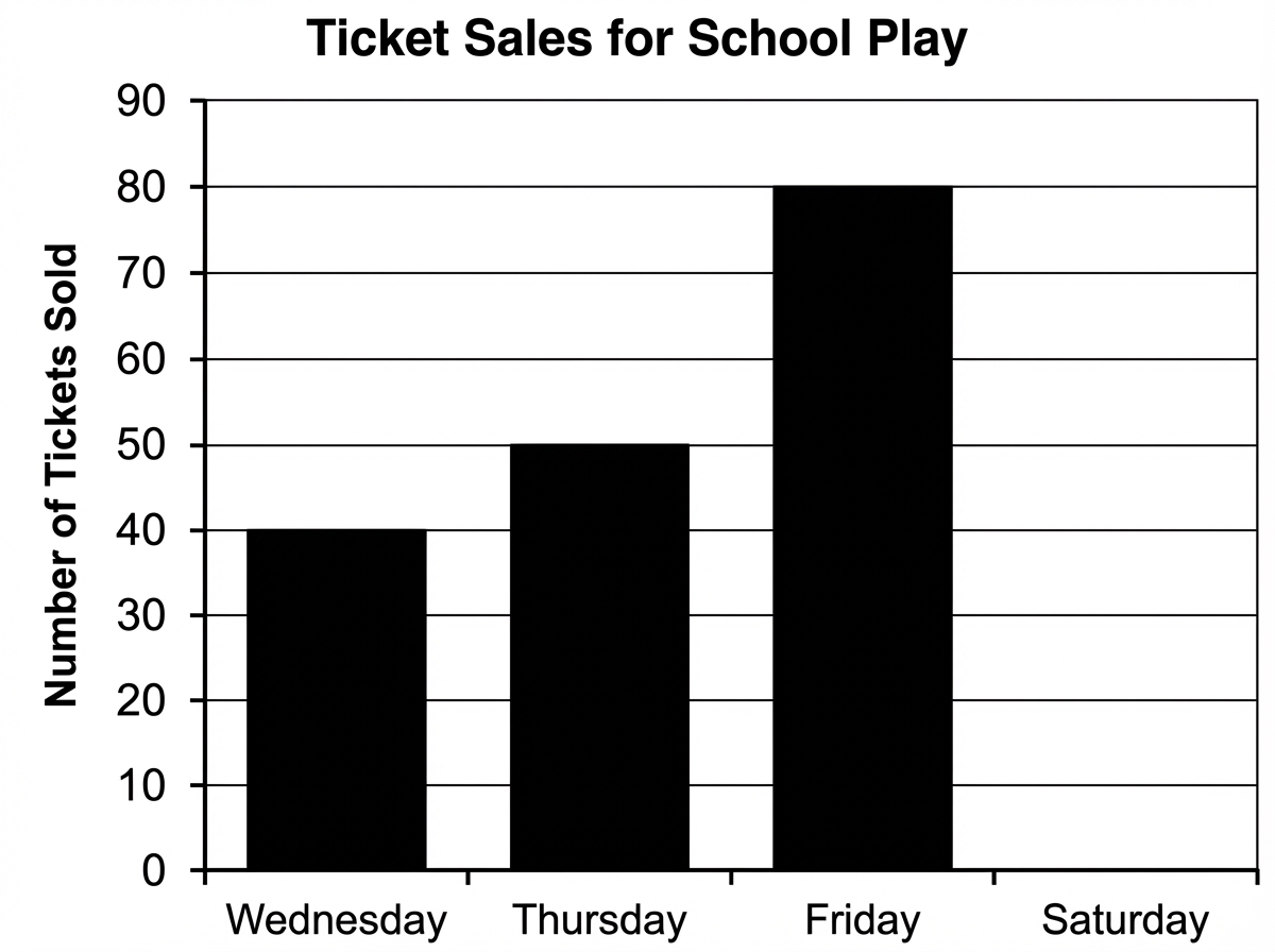
- To find the total number of tickets sold over the four days, multiply the average by the number of days: . Next, find the sum of the tickets sold on Wednesday, Thursday, and Friday: . Finally, subtract this sum from the total to find the number of tickets sold on Saturday: .
Show Solution
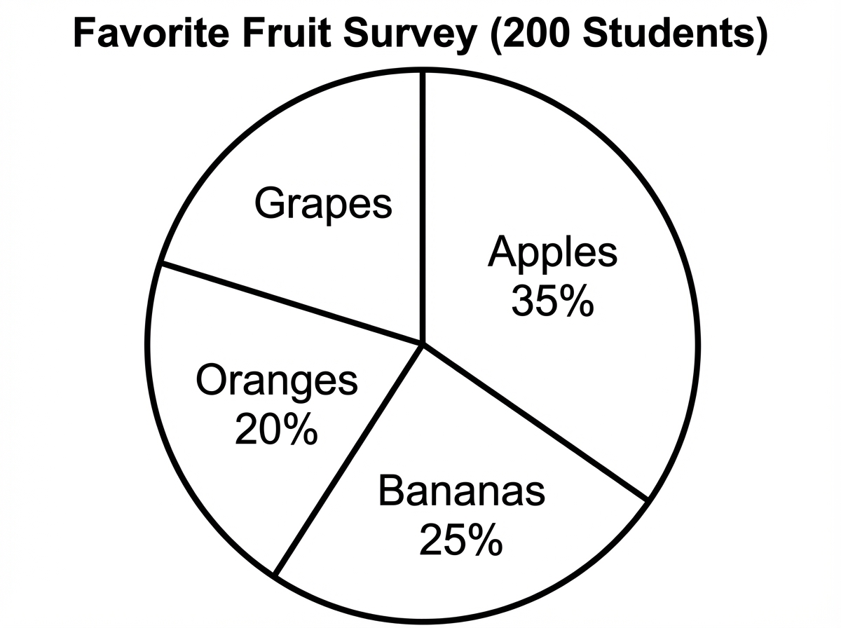
- First, find the total percentage of students who chose apples, bananas, and oranges: . The entire circle graph represents 100%, so the percentage of students who chose grapes is . To find the number of students, calculate 20% of 200. Since , you can multiply: .
Show Solution
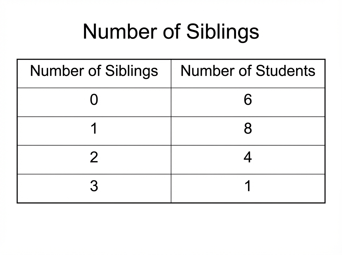
- First, find the total number of students in the class: . The median is the middle value when the data is listed in numerical order. For 19 data points, the middle value is the 10th value (since there are 9 values before it and 9 values after it). The first 6 values are 0. The 7th through 14th values are 1. Therefore, the 10th value must be 1.
Show Solution
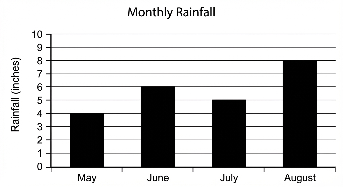
- First, calculate the predicted rainfall for September. June's rainfall was 6 inches. A 50% increase means adding half of June's rainfall: inches. Next, add the rainfall amounts for all five months together: inches.
Tips & Strategies
- Use your pencil as a ruler! On the SSAT, you can use the straight edge of your pencil or a piece of scratch paper to trace a line from the top of a bar over to the y-axis. This ensures you read the exact number.
- Watch out for sneaky scales! Sometimes the y-axis counts by s, s, or even s. If a bar stops halfway between and , it means , not .
- Always read the graph's title, the x-axis label, and the y-axis label before you even look at the question. This primes your brain to understand the data.
Common Mistakes
- Watch out for confusing bar graphs with histograms! Bar graphs compare different categories (like dog, cat, fish), but histograms show continuous ranges of numbers (like test scores from , ).
- Don't forget to check the key or legend on pictographs! Sometimes a single picture of a pizza doesn't mean pizza; the key might say it equals or pizzas.
Frequently Asked Questions
What is the difference between a bar graph and a histogram?
A bar graph compares different categories, like your favorite flavors of ice cream, and the bars usually have spaces between them. A histogram groups numbers into ranges, like how many students scored between and on a test, and the bars usually touch each other!
Do I have to draw any graphs myself on the SSAT?
Nope! The SSAT is a multiple-choice test. You will only need to read, understand, and answer questions about graphs that are already drawn for you.
What if the dot on a line graph is floating between two numbers on the side?
You have to estimate based on the scale! If the line is exactly halfway between and , the value is . Just look carefully at what the axis is counting by.
How much math do I actually have to do for these questions?
Usually, just basic addition, subtraction, or finding simple fractions like or of a pie chart. The hardest part is usually just being careful and finding the right numbers on the graph!